On the cover you see I used the Cottage Cutz Apple Pie die. I selected the criss-cross pie top (the die has two pie tops to choose from). As you can see I gave you the Copic color numbers for the colors that I selected to highlight the card stock. At the top of the chart I made tiles of all the colors of card stock that was used. I tried to stay in the Black/Red/White theme. . the silver/cream and brown of the kitchen utensils worked in well.
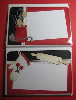
This is one of the two pages that I have shown you today. This page I used the Cottage Cutz Crock with Utensils die. I wanted to stay in the Black/Red/White color group so the crock is red (so I added the heart as a embossed item to the crock, by using the Copic highlights of darker red behind the heart). On each page I ran a black polka dot paper as a pocket. I only attached the black paper at the outer edge, so there is a slot to slide the recipe card under. All the die cuts and borders are attached to the black. so the card will slide under all the over lapping die cut designs.
You can switch the border throughout the book from any of the four sides. This not only adds contrast to the designs, but also allows the book to stack flat because not all the thickness of the card stock designs are on one side of the book. This is always an issue when designing an album. How do I keep the level of the album?. . You alternate the added thickness of embellishments!!! The pages all fit a 3" x 5" index cars (shown here in white).
Think about doing a baby album this way. If you start with 12 TO 24. . 4" X 6" card stock pages and a 4 1/4" X 6" cover & back. Than place the photos or journaling cards under your embellishments. . . You can work on the pages all at once and WHIP those mini albums out . . just in time. . for Christmas gifts.
Thanks Barry


