Saturday, May 27, 2023

Flowers 3 - Hugs Card

Hello CottageCutz friends! Thanks for taking the time to stop and visit with us today. It's Mary Marsh here bringing you the Saturday edition of the Blog.

We have a brand-new release in the online store. It's our Folk Art release with 19 new designs. For a limited time, you can pick up the entire bundle for 65% off. The individual dies are 35% off

The folk-art designs are so perfect for cardmaking, journaling, and scrapbooking. They allow you to add a beautiful touch of folk art to whatever you may be creating.  The team will begin showing ideas in the next week. 

We are also having a Memorial Day sale with savings of up to 70% off.  Check out the store early for the best selections. The sale ends Wednesday.

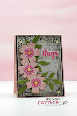
Today for your viewing pleasure, I am featuring the Flower 3 and Leafy Branch 3 dies. I created a card for my good friend who just received some not so good health news on her hubby. 

I started my card with my background. I had this envelope in my stash and decided to cut it apart and use it as designer paper. I just thought it was too pretty to use as an envelope. I layered it with an espresso cardstock and then my card base is a powder pink shade.
Powder Pink Base: 4 1/4" x 5 1/2"
Espresso Layering Panel: 4" x 5 3/8"
Designer Paper Panel: 3 7/8" x 6 1/4"
I cut the Flower 3 images in powder pink cardstock and the pistil in a bold pink cardstock. I used a yellow enamel dot for the centers. The Leafy Branch 3 is cut in olive cardstock.
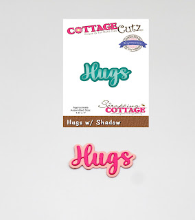
I cut my Hugs w/Shadow die in the 2 shades of pink cardstock. 
Now I am ready to start card assembly. I attached the designer paper panel to the layering panel with double sided tape. 
For the images I wanted them lifted slightly off the background, so I used dimensional adhesive to attach them. For the leaves I used a clear drying glue.
To finish off my card I attached the Hugs phrase, added a few enamel dots to the card corners and then secured everything to the card base. 
Well that's it for me for this week. See you next Saturday.

Reminder: We are having a design team call. If you like working with dies and cute images, you have until Wednesday, May 31st to send in your application. Click here for all the details. 

Dies I used to create card:


Thursday, May 25, 2023

You're Tweet

 Hello Friends

It is Pam creating with you today!

I am making a few thank you cards for my stash.  I am also making some for our little sale at church.  It helps pay for our teens to be able to go to summer camp.  The die I am using is the Fence w/ Flower Garland from the Flowers and More release.  Also used on this card is an oldie Tree of Nature.


Design Steps:


1.  Using the Fence w/Flower Garland cut out white, green, yellow and blue card stock.  Using the Tree of Nature die cut out brown, green, blue (bird), yellow(cage) and light brown(bird).  Using the Spring Grass die cut out green card stock.  Assemble with a fine tip glue

2.  Cut a piece of white card stock 3 1/2 x 4 3/4.  Blend blue ink onto the card stock and then splatter with water

3.  Begin to assemble the card starting with the grass making sure to only put glue at the very bottom of the grass so you can tuck in the tree and then the fence

4.  Add the leaves, birdcage and bird to the tree

5.  Stamp your sentiment in black in to the right of the tree.  (I decided I didn't like the way it looked so I stamped the sentiment on white and layered it with the blue). Use a A2 white card base and a 4 1/8 x 5 3/8 piece of embossed white card stock.  Glue your embossed piece to the card base and then glue the blue panel to the white embossed piece


6.  When I have left over scraps from the card I like to use them inside.  It is a really good way to use them up along with any extra dies that didn't get put on the front of the card

CottageCutz Products


We have more inspiration on our YouTube Channel check it out HERE

Thanks so much for stopping by!  And I will see you next Thursday.

Blessings and Take Care


Wednesday, May 24, 2023

Mini Lemonade Stand Shadow Box

Hello Cottage Cutz friends,
Melinda here with you on this wonderful Wednesday. Today I am sharing a cute little shadow box I created for my entrance table decor. I love making tiered tray and themed little decor pieces for that front table. It is a treat to come home and see the seasonal decor. Here in Florida it is hard to feel the four seasons. We just get varying degrees of HOT...lol!

Here's a look at my finished little shadow box. I started with a shadow box from the dollar tree. It had another image in the center but I took that out to start with a flat surface.

I started by decorating the inside of the shadow box with some paper. I used some black cardstock for the base. I then added a white mat and some diagonal plaid patterned paper that I created and printed from my home inkjet printer. I cut it to size and then added all that to the shadow boxes inside.


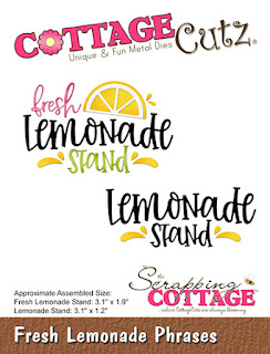
I created a little sign for the top by adding the word fresh and one of the lemon wedges from the Lemon phrases die set. I cut the lemon wedge down. For the black base of the sign, I cut out the lemonade stand in black cardstock and cut the top and sides off. I used just the bottom piece.
I then cut out two banners in white cardstock and then used my markers to color the pennants of the banner in yellow and green. 

Next I went to work creating that sweet little lemonade stand. I cut the base out in kraft cardstock. I then added some brown marker to bring out the wood grain look. I used my black marker to darken the word Lemonade. It cuts out with the die cut to make things real easy! I then cut and colored the banner and added my pitcher, glass, lemons and stand sentiment. I added all that to a square scallop stitched mat with a green polka dot patterned paper.

Next, I needed to make something to give my little lemonade stand some lift off the base of the shadow box. I didn't want to layer a bunch of foam tape. So instead I made a little 3" x 3" box. 


Here are some .75" x 11" strips that I scored and folded at 3". I did this so I could adhere them to the inside of the box or riser as I like to call it. It makes it super sturdy.

Here is my little riser after I have added the extra layers. Nice and strong. It will keep my little lemonade stand nice and sturdy and flush. I adhered this to the base of the shadow box and then added my little lemonade stand.


Here is a view with a slight angle. You can see how much lift the stand mat and sentiment have off the base. But it is nice and sturdy and the edges won't collapse in. The shadow box is 1" thick so making my riser .75" thick still kept the mat inset enough.


Here is one last look at my completed shadow box. I am making a few more items for my decor that I will be sharing and then I will share a final photo of how it all comes together. 

Dies Used


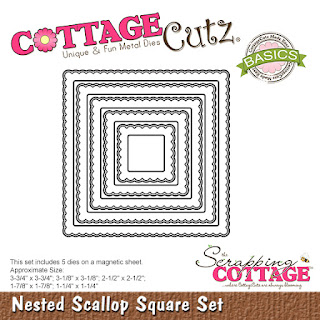
Nested Scallop Square Set
The stitched one I used is unavailable at the moment.
This one would be a great alternative.


Don't forget to also check out the Cottage Cutz YouTube Channel for some great crafty videos!

Well that about covers it for today! Until the next time, have a wonderfully crafty day!


Tuesday, May 23, 2023

TMBT: Take Me Back Tuesday Sweet Treats Die Release Projects

Happy Tuesday crafty friends!
Today we are sharing another Take Me Back Tuesday! This week we are featuring several amazing projects the Cottage Cutz designers created with last summer's Sweet Treats Die release,

 
Happy Birthday
Check out all the fun details on this sweet birthday card by designer Pam.


Find out how to make this super fun fold card with a super DEEE-Lish theme by designer Mary.

Get the details on this colorful card with some of the cutest treats by designer Marla.


Check out this wonderful treat of a card for Dad from designer Mary.


Details on this incredibly cute card by designer Marla.


Head over to see how this card is made by designer Kristine.


Head over for the details on this berry-licious card by designer Pam.


Get the details on the Soda-licious card by designer Melinda.


This explosion of sweetness slimline card is a must see by designer Marla.


Get all the details on this shaker card from our designer Kristine.


Head over for details on this fun Gnome treat card by designer Melinda.

Curious minds want to gnome! How this little guy was made from a cupcake! Head over for details.

Here is a look at the amazing dies from the
Sweet Treats Die Release

Thank you so much for stopping by and sharing your crafty time with us! Until the next time, have a wonderfully crafty day!
-Melinda